UX Case - Plan & Play App
UX Academy, UX ICT Architect course
Role: UX Design & Research
Timeline: August 2021
Tools: Figma, InDesign, Miro, Marvel, Pencil & Paper
During the project, I kept the Design Thinking methodology in mind.
Introduction
This case is born out of a personal struggle. This year, I started with tennis lessons. To become a better player, I like to play as much as I can. In addition to the lessons, all players are able to book a court for some 'free' playing. The experience of booking a court requires a lot of personal effort, from customer and provider: you can call, e-mail, or WhatsApp the tennis club and ask if there is any court available at your time of preference. Most of the time you don’t get an answer back right away. So you have to wait and hope for the best. Not a very smooth experience, right?
💡 That’s how I came up with the idea for an app: Plan & Play
Empathize
Personas
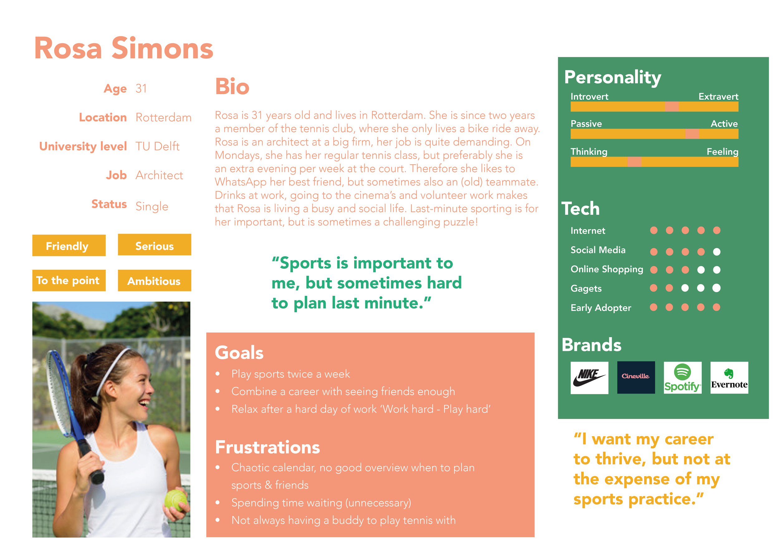
The first step is to empathize with the target audience. I created two personas. Ideally, if there is enough time and budget, I would first do user research before creating my personas.
Because I already know the tennis club quite well, I made the main persona (Rosa) based on someone from my tennis class. You can see it as field research ;-). The second persona (Kees) is created based upon another important segment of the club’s members, the (almost) retirees.
Notice how Rosa's user needs are more focused on combining her sports activities with her busy life where work is an important part of her life, whereas Kees is mostly concerned with staying fit and healthy and being part of a community.
2. Define
Problem Statement
In order to understand the problem we are trying to solve, I defined a clear problem statement and solution space. This problem statement arises from the personas and the current situation.
User & Business needs
When is the project a success? The solution for this project should benefit both the user and the business. In order to make sure we won’t lose track of one of them, I wrote the high-level user and business needs.
User Scenario
To get a better understanding of how Rosa might act to achieve the goal (the booking of a tennis court) I wrote a User Scenario. I wanted a better understanding of her needs, motivations, and barriers. In this story, I highlighted the features in bold which can be expanded upon to discover user stories that should be included in the experience.
‘‘
At noon I finally have a little break to catch some breath. All morning I sat behind the computer to finish a deadline. I really hope to get some exercise today! The weather is nice and sunny, so preferably outside on the tennis court.
I send a WhatsApp to Anne if she feels like playing a game with me tonight. ‘Yes, nice! Book us a court. Around 19:00h?’ Anne says. Nice, but I don’t really have time to call the club. Most of the time they don’t pick up the phone right away and I would like to cross this off my list a.s.a.p. During class on Monday, I heard that there is a new app to book your own court. I download it and am seeing that I need to register. Fortunately, they don’t ask for that much personal info and I am registered in no time. Once the app is up and running, I want to reserve a court as fast as possible, since my next meeting is about to start. With the Court Planner I can see at a glance there is still a court available at 19:00h. I click on ‘book court’ and my details are filled in automatically. Great, that saves me some time! I am redirected to the checkout to pay. I don’t have time for that right away, I have to go to the meeting now. Ai! Because I’m in a hurry, I missed the input field for Anne’s email address. I will forward her my reservation confirmation via email. But nice to know the app provides a function like that. I hope the payment can be completed later.
One hour later, Anne messages: ‘Sh*t! I have to stay a little longer at work. Can you still change the reservation? I should be able to be there at 20:00h!’. I grab my phone and see what is possible. In the app, I go to my booking history. Yes! There is another court available and I can easily change it. Now I am using the app again, I pay for my booking right away via iDeal.
In my next coffee break, I feel curious about what else is possible in the Plan & Play app. I click around a bit and find out I can also see the schedule of my fellow club members. I see my friend Luuk ends around the same time as we do, so I text him: ‘Hey, I see you're at the club tonight too! Fancy a drink after playing?’.
‘‘
3. Ideate
Features
To help me set priorities, I created an overview of the possible features of the app. For this, I also used the features that I wrote in the User Scenario. To organize them and help me set priorities, I used the MOSCOW-method.
Sitemap
Then, I created a site map to make a visual overview of the needed functionalities of the app. This is the first suggestion and could be used as a discussion point during the design process. The yellow-marked functionalities are the ones I created wireframes for in Figma.
You can see that the structure of the sitemap is clear. There are not too many options and once you are logged in, you can make a new booking right away.
4. Prototype
Wireframes
With the personas and features in mind, I started to sketch some low-fidelity wireframes on paper. I tested these wireframes in class with the Marvel Prototype app.
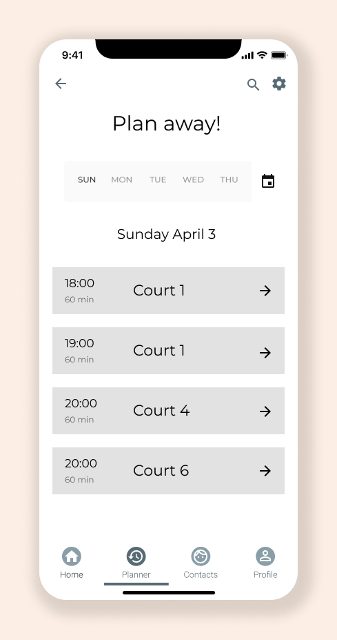
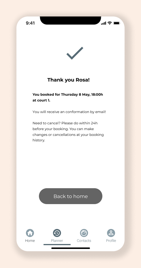
After a few iterations, I designed high-fidelity wireframes in Figma. The wireframes are representing Rosa's booking journey (the yellow-marked path on the sitemap).
When you enter the dashboard, you can book a court right away (since that is the no 1 call to action of the App). Besides making a new booking, you have a clear view of your upcoming reservations and your booking history. To keep everyone informed about what’s going on (to stay up to date about the community, which is important for the persona of Kees) there is space for information about upcoming (
The rest of the flow represents Rosa’s journey of booking a court. You have a quick overview of the available courts and you can easily share your booking information with a friend.
The dark grey colors are accent colors.


5. Test
Usability Test
Reflect
What have I learned from this project?
Process
Because of my background in project management, I like the get things specific. When you are sketching your wireframes with pen and paper you’d rather wait a bit before drawing conclusions. I’ve learned to sketch more than one idea, and to test this early in the process. This is even okay with your drawn wireframes!
Personal
Since this was my first real introduction to the UX profession, I can say I have learned a lot! At the UX Academy, I have learned UX is so much more than only drawing wireframes. The Academy developed its own UX steps (Understand, Design, and Evaluate) which have a lot in common with the Design Thinking methodology. Each of these steps includes different deliverables. How do you do research? How do you make a useful persona? And what’s the importance of a good user scenario? After completing the course I felt like I have a clear overview of the UX design process. And it made me a UX enthusiast right away!
Tip 💡📚: in advance of the course, I had to read ‘Don’t make me think’ by Steve Krug. If you haven’t read this book yet and fancy a career in UX Design, I truly recommend reading it. Although it is a slightly older book, it gives you a solid (and easy to read) introduction to UX!


